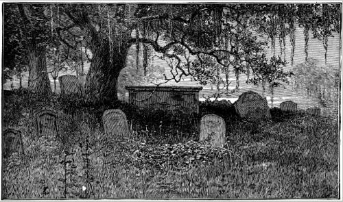
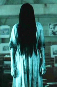
A story whose primary purpose is to invoke fear onto the audience.
Typical narrative is generally something bad is happening; either somebody is possessed in which case it fits into the satanic/demonic sub-genre; somebody has a grudge, or seeks revenge from somebody and kills everybody in their way, typically a slasher film. Somebody is just obsessed about something or has negative traits, similar to Hannibal in Silence of the Lambs and subsequent films.
There is always the hero and the villain, the audience is traditionally positioned with the hero and is fearful of the villain, although some more recent films have played around with this convention and have made films more sympathetically steered towards the villain, in an attempt for audiences to be able to understand them. Some horror films do not even have a sufficient narrative, some like Saw and Final Destination although there is a narrative, do not particularly makes sense and are just used to invoke fear and distress onto audiences due to the violence, the blood and the gore. I think I want our film to have a distinct storyline, one that fits the more psychological horror genre, and that positions the audience with the villain, but has a certain ambiguity in the opening as to who the villain really is.
Conventional Characters:


Archetypal heroes: Brave, courageous, sometimes morally flawed, potentially role-models, usually filmed in bright lighting, sense of vulnerability, always have a weakness, often young, solve the puzzle.
Archetypal villain: sinister, evil, misunderstood, often carry weapons e.g. blades, cover faces, dirty, blood spattered, filmed in dark lighting, bad childhood, masks, power crazy, corrupted, dangerous.
Stock Characters: make the heroes look better, the fall-guy, victims so the hero survives, dispensable, boring, sidekicks.
Conventional Locations:


Conventional Costumes:


Lighting and Colour:
Dark to create an enigma, and enhance horror due to impaired vision. Strobe, lightning effects can be used to create suspense and drama and to obscure vision so the horror is enhanced on top of the darkness.
Colour is often black and white, very dark to colours to represent horror, red is used to connote danger, blood, the devil etc. but essentially conventional horror films are very dark and somewhat faded, with limited lighting to create the desired effect. Some films, like the more teen-horror, play around with the conventions and make the colours bright to contrast the impending doom, similar to that in scream.
Other colours frequently used for effect are blue, green and grey, but all faded and with lowered hue and saturation levels to enhance the horror effect.
I think with our lighting we want to juxtapose the ideas that are presented in our narrative, and have seemingly normal bright lighting, but at the same time I am drawn to the overall lowered hue and saturation levels, so although it will be bright to give the audience a false sense of security it will be faded and washed out to reiterate the genre and to create a style for the film.
Font Suggestions:


 When I was looking for fonts, I was thinking about horror but also our idea so I looked more at the handwritten styled ones than any others. Personally I like the 1st and 5th ones the most, but obviously it depends on hw our idea goes as to which font we need.
No comments:
Post a Comment